Sonus Construction Group
An editorial-style site for a general contractor whose real audience is investors and developers vetting a partner, not homeowners browsing a portfolio.
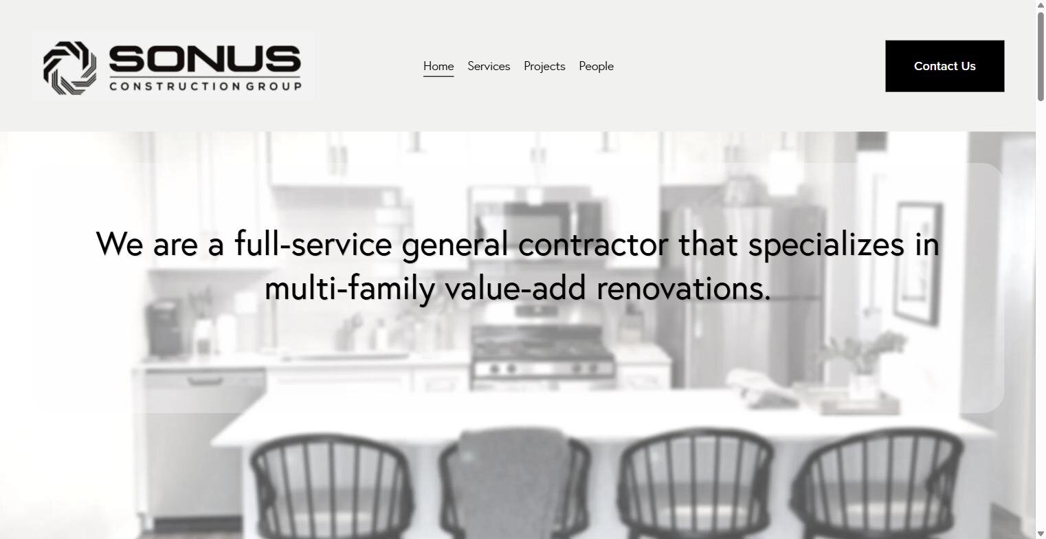
Sonus works multi-family value-add renovation — the people reading this site are doing diligence on a construction partner, not shopping for a remodel. That shifted the design away from typical contractor-site conventions (big hero CTA, testimonial carousel) toward something closer to an editorial one-pager.
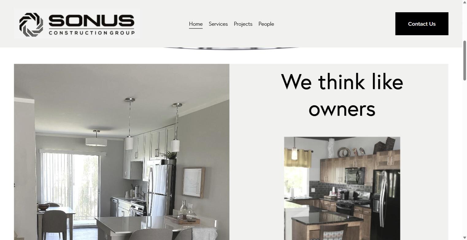
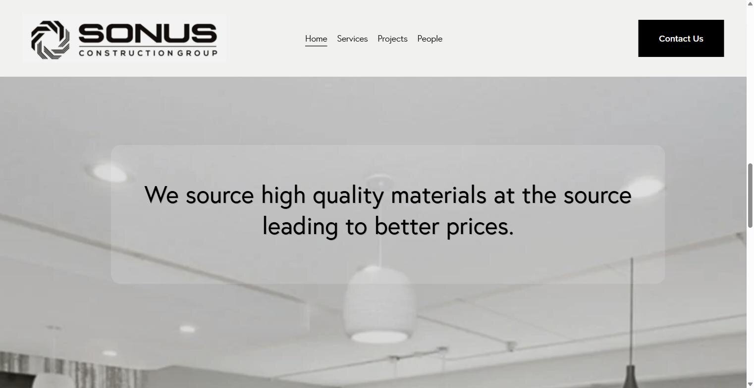
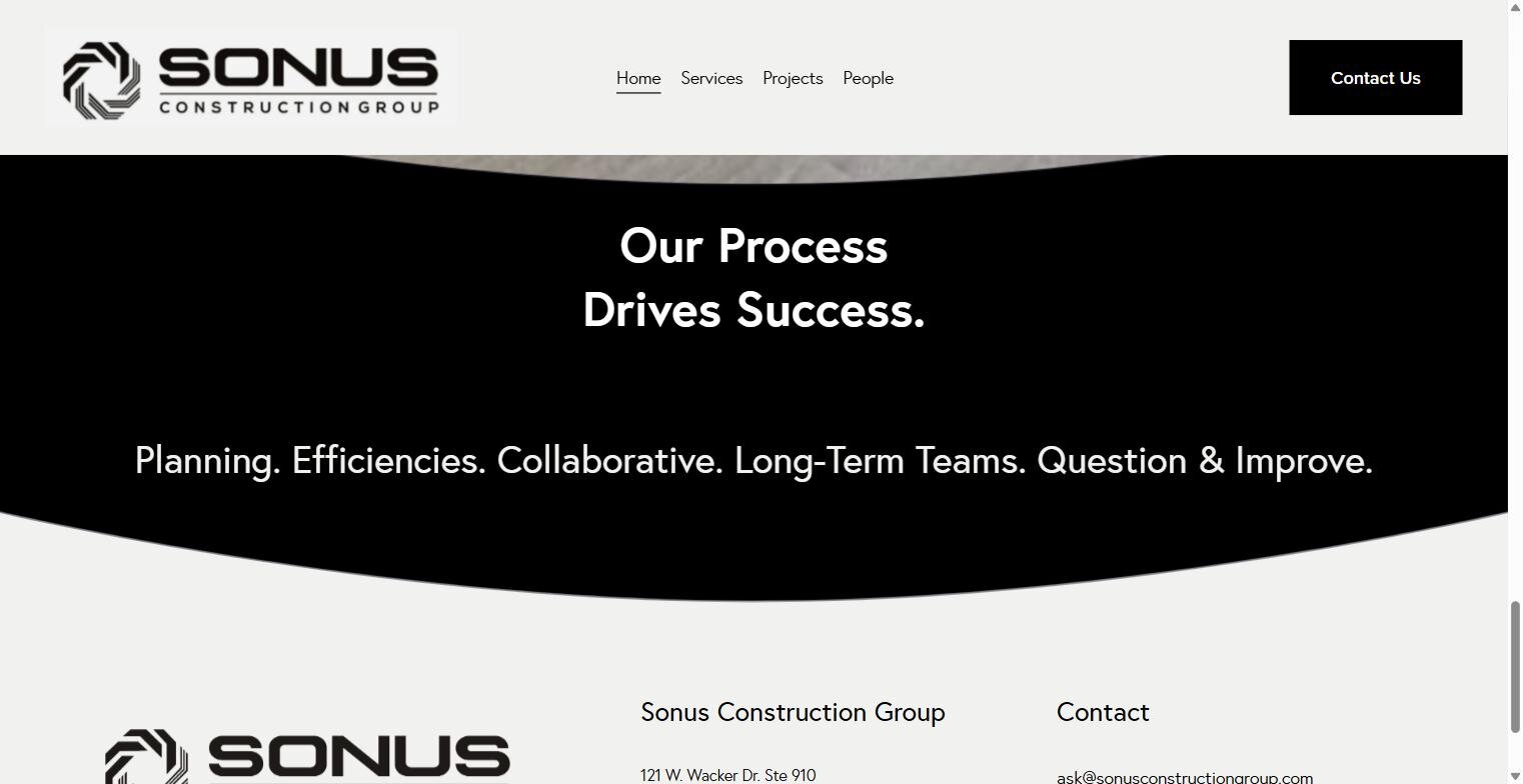
The "we think like owners" positioning isn't just a headline — it shaped the information architecture directly. Process and material sourcing get the same visual weight as the project portfolio, because that's what a developer actually checks before signing.
High-quality project photography does most of the persuasive work; the layout stays minimal and gets out of its way.
Editorial, Not Corporate
A minimalist layout lets real project photography carry the narrative instead of stock-photo boilerplate or a generic contractor template.
Brand Positioning Baked Into Structure
"We think like owners" shows up in the page order itself — process and material sourcing sit alongside the portfolio, not buried below it.
Investor-Grade Hierarchy
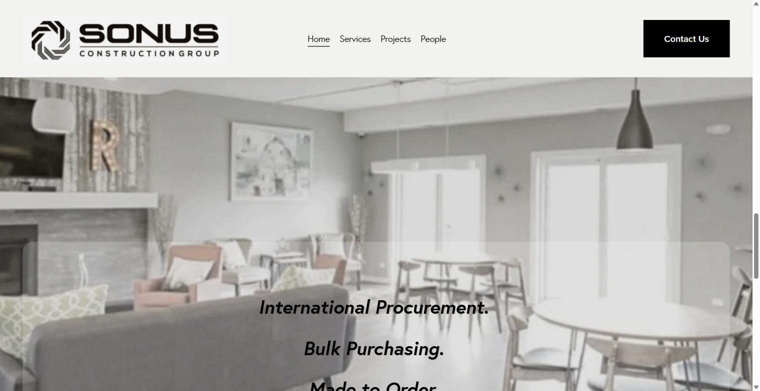
Services, process, and sourcing are each cleanly separated so a developer doing diligence isn't hunting for the section that matters to them.