dougrosenberg.com — V2
An Astro-from-scratch exploration of the live dougrosenberg.com — chasing custom, considered design and a specific brand concept instead of generic musician-site defaults.
This is a deliberate rebuild-as-craft-exercise, not a "the live site needs this" project — two honest reasons drove it: wanting to work in Astro again after enjoying it on Haxbyte, and wanting to move further away from the typical AI-generated-site look. That second goal got written down as a concrete, checkable list rather than a vibe: no centered-hero-plus-two-buttons, no glassmorphism/gradient-mesh as the default "premium" treatment, no default system-ui/Inter-everywhere type, no every-card-the-same-rounded-corner treatment, no perfectly safe symmetric spacing.
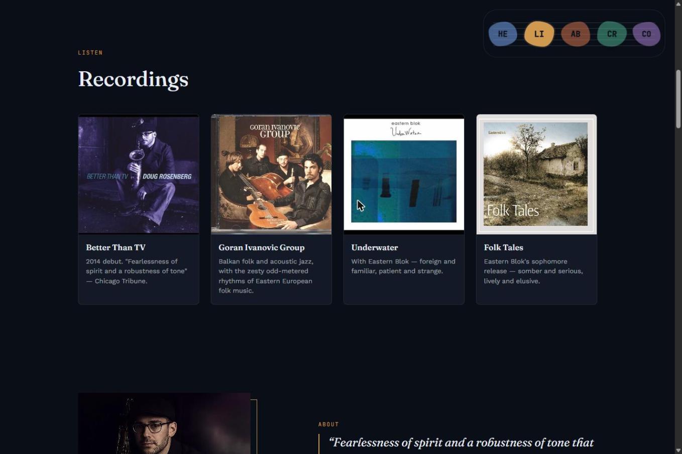
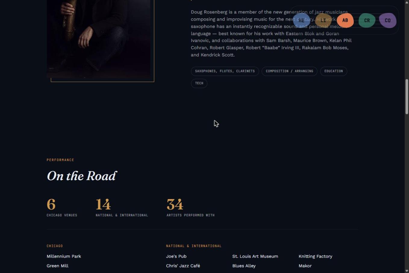
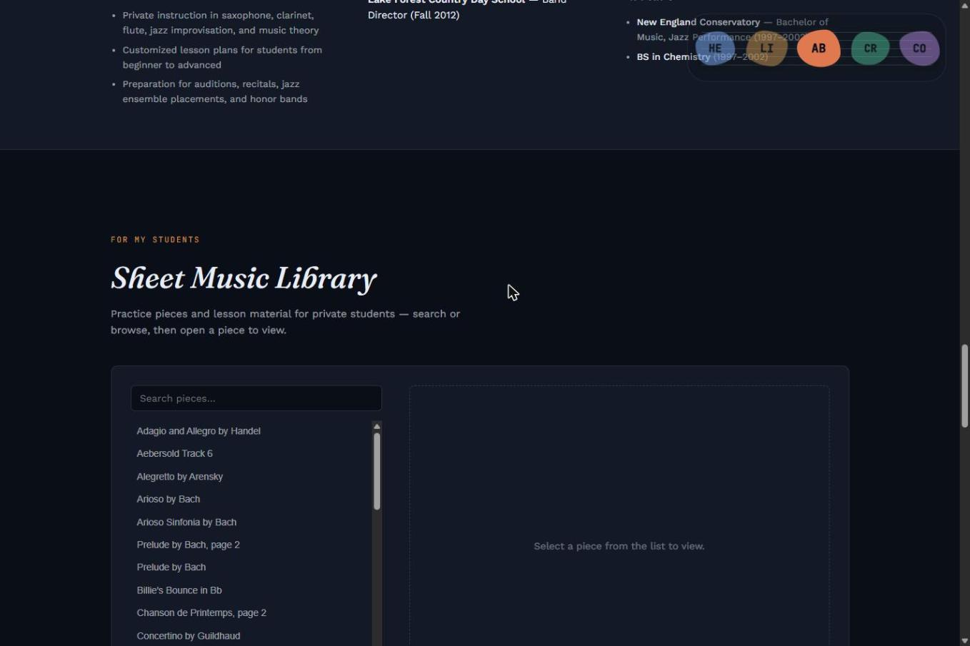
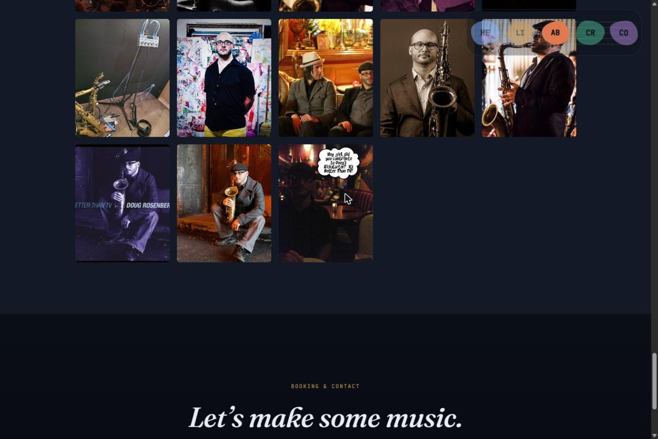
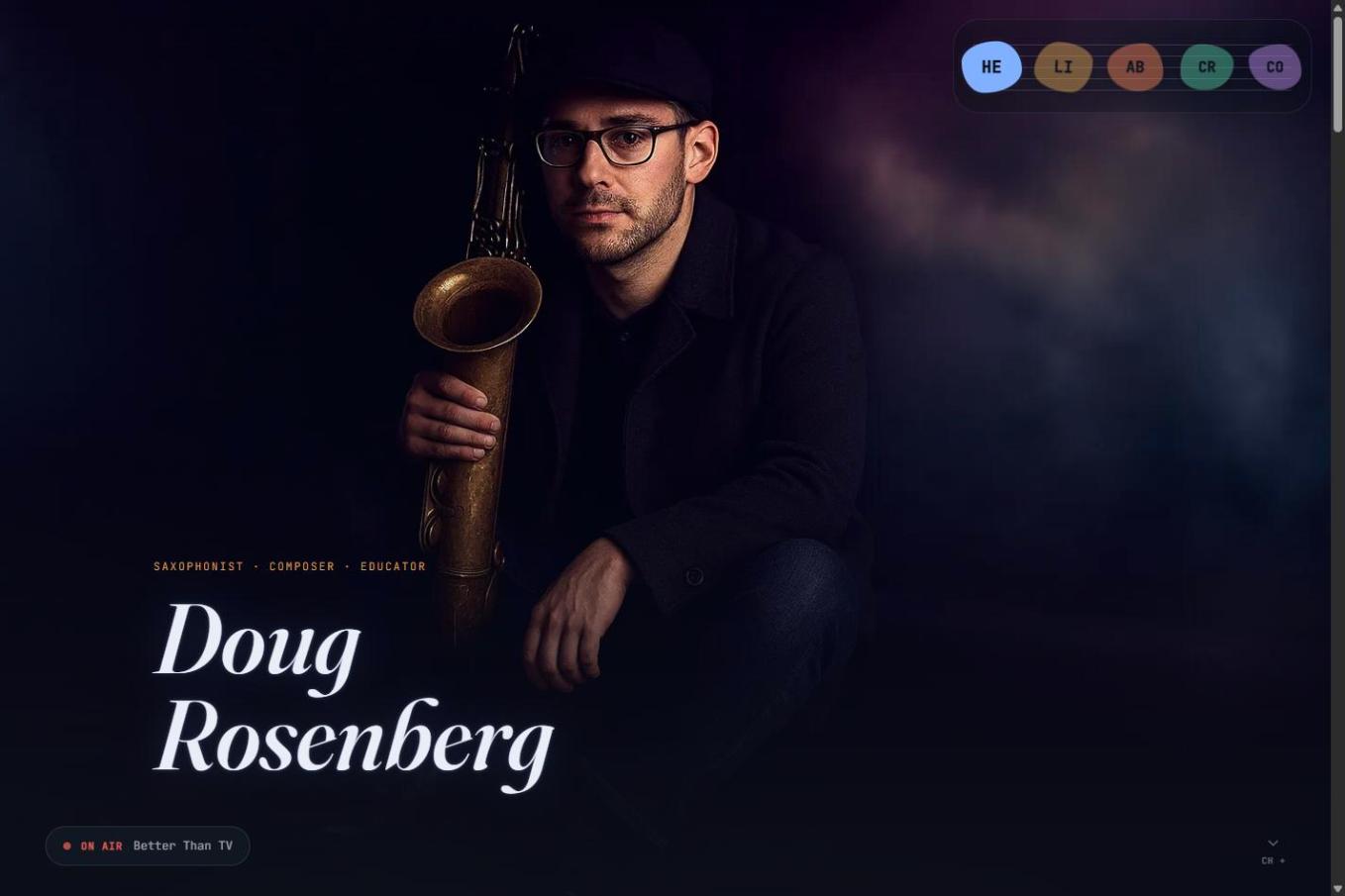
The nav is the clearest expression of that list: instead of a conventional top bar, a corner "staff" element holds five colored note-blobs, one per section, scroll-tracked so the current section's note glows while the rest dim. Below 860px, where hover-to-reveal doesn't work and the nav is meant to stay secondary to the scroll anyway, it collapses to a small hamburger toggle instead of trying to force the desktop treatment onto a touch screen.
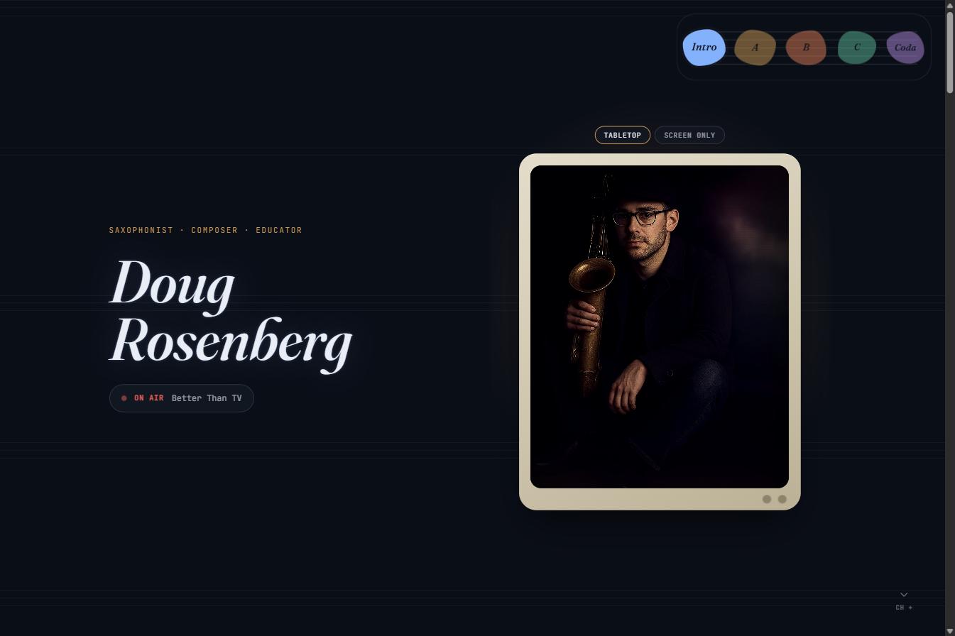
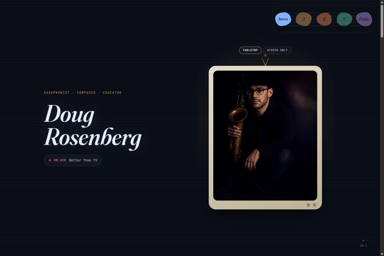
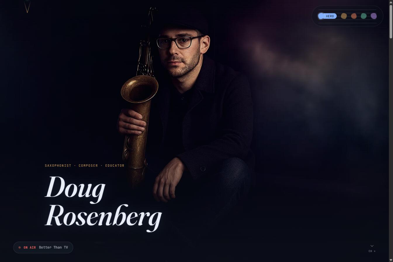
A second, still-open layer sits on top of that base system: the debut album Better Than TV lends its wry, unpretentious voice to small details already live — an "ON AIR" pulsing-dot pill standing in for a waveform, a "CH +" scroll cue instead of a plain arrow. Three additional hero prototypes push that concept further before anything gets locked in: a retro tabletop-TV frame around the hero photo with lead-sheet-style section labels (Intro/A/B/C/Coda), the same frame with an antenna accent, and a full-bleed graded photo with an expanding nav pill instead of the console frame.
AI-Tells, Named and Checked Against
The thing to avoid was written down as a specific, checkable list — centered hero + two buttons, glassmorphism/gradient-mesh, default system-ui type, uniform rounded-corner cards, safe symmetric spacing — rather than a vague "make it less generic" instruction that's impossible to verify against.
Corner Staff Nav, Not a Top Bar
Five scroll-tracked note-blobs in the corner replace a conventional nav bar, glowing to show the current section. It collapses to a hamburger dropdown below 860px rather than forcing a hover-dependent desktop pattern onto touch.
Three Competing Hero Directions, Live
Rather than mocking up alternatives offline, three full prototype pages (/preview-tv-leadsheet, /preview-shape-antenna, /preview-graded-expand) are deployed alongside the real index, so directions can be compared in a real browser before one is chosen.